


Kiandra Insights
A Redesign for the Myki Website

A few weeks ago, my Myki card was running out of money right before leaving work and, having some extra time, I went to their website to top up. WOW – the website looked exactly like how it did in 2013, which was how long ago it had been since the last time I’d visited. So, during my down time at work, I decided to re-design the Myki homepage.
First thing I did, was search if there were any concept design online, and found there were actually quite a few amazing concept designs for the app, but not a lot for their website.
Why the desktop version?
I always keep in mind that “mobile first design” is important and I wasn’t sure if it was worthy to re-design the Myki website desktop version. So I did some research and asked others about their experience with the website. I was surprised how engaged everyone was when talking about the Myki website and decided to tackle the problems they raised.
Primary research
I had a chat with over 20 people – at work and the gym, a few friends, mainly over why they used the website over the Android only app and what challenges they had on the website. Here are some of their grievances:
- Hard to read
- Buttons are too small
- Too many wordings on home page
- Hard to find what they want
- Not multilingual
- Not accessible
- Can’t nickname cards
- Can’t manage multiple cards in one go.
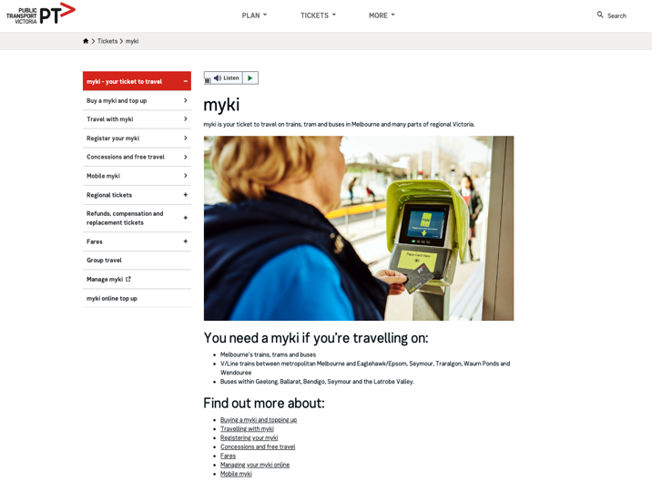
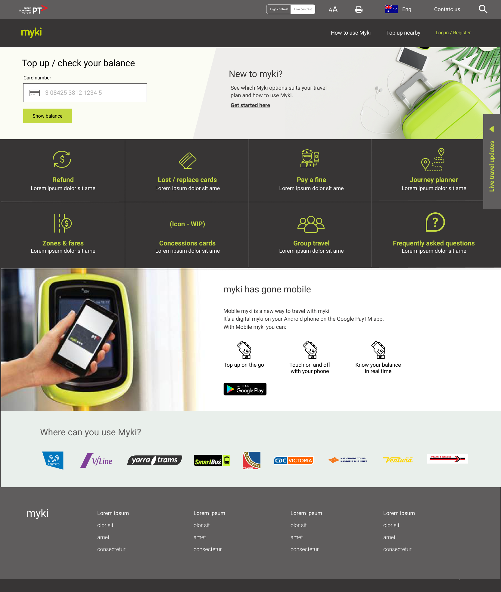
Here's the current homepage:
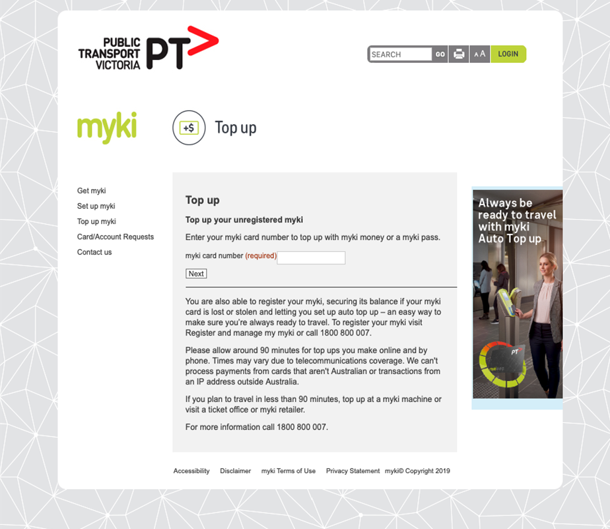
And the current top-up page:
Secondary research
I get very excited when I get to do research because every time I do research, I gain knowledge. For this particular project, I looked over different country’s public transport ticket systems, including Asia, Europe, Canada, as well as our ones in Australia. I also got inspiration from credit card and top up cards.
I am particularly impressed by Presto from Canada and got a few inspiration from there, which included:
- Their website is very simple yet professional
- “Actions” are very straight forward
- They separate users as “new users” and “regular users”
- You can tell they are very “new user friendly” but at the same time encourage people to register an account without pushing them.
Personas
Combining the great insights from the people I spoke to, along with their pain points and needs, I formed the data into two personas. The wireframe I created would be based on solving the problems of these personas:


With the Myki homepage, this is designed based on Claire’s needs:
.png.png)
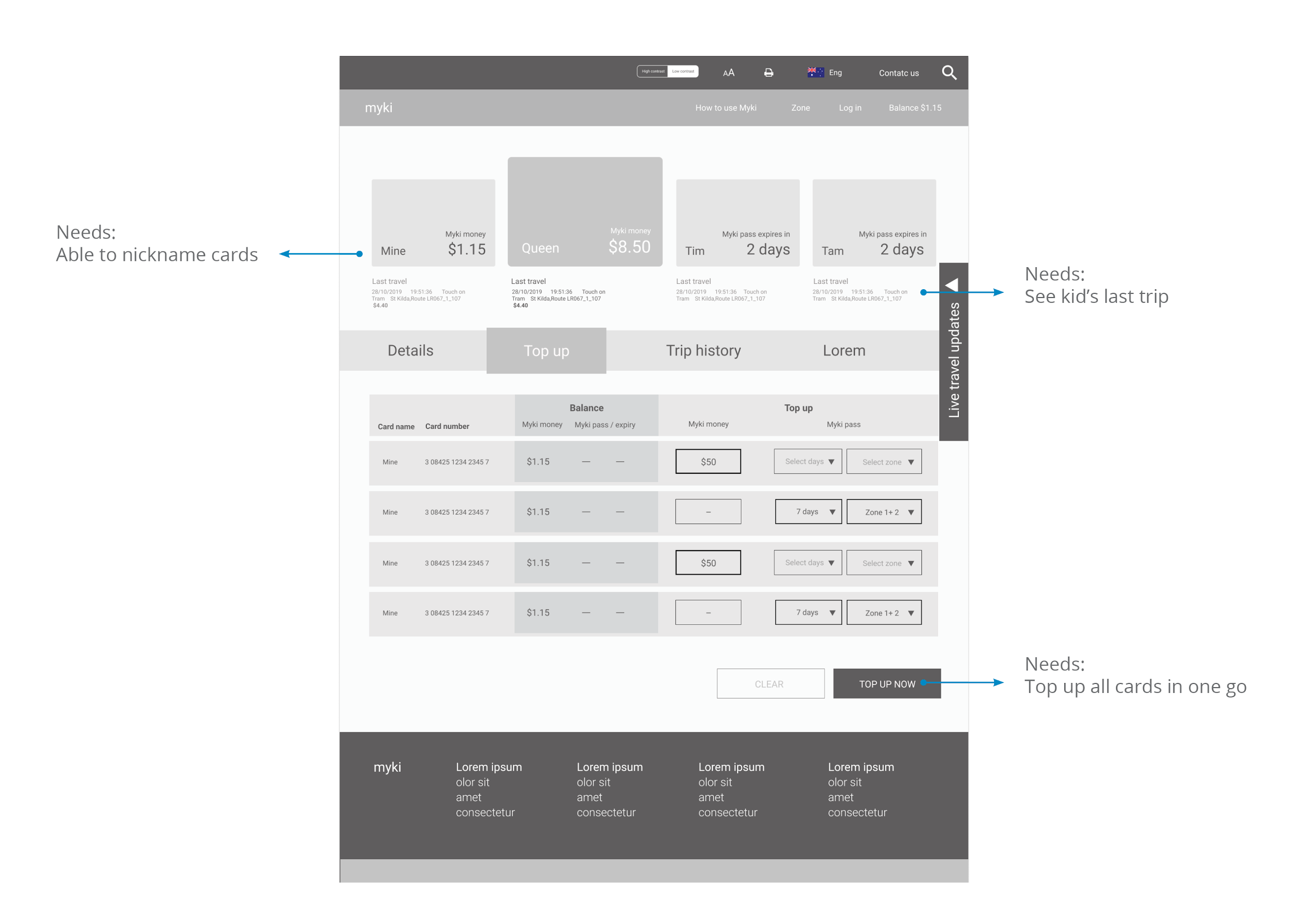
With the Myki top up page, this is designed based on Oliver’s needs:
And this is hi-fi:
With limited down time, I managed to do two pages and showed them to some of those that helped with my research. Most of them were very happy with the homepage, they could check their balance right away and all the “actions” were easy to find.
With the top up page, I was very glad to hear some parents saying it was a big ‘relief’ for them, when they had to manage six cards at the same time, as the new page was designed to save them time.
It was great to hear design could improve their experience and save time and why research is an important part of design. Listening to users, finding out their process, what they struggle with and what they need, and then creating a solution based on that, is so rewarding.
This is why I’ve really fallen in love with user experience (UX) design. I’ll continue to tinker on my new Myki designs, in the meantime, I welcome any feedback you have.

More insights

Performance testing is a commitment to excellence
At Kiandra, we recognise and acknowledge the pivotal role of performance testing in achieving this fine balance. In this blog, we will unravel what performance testing truly means at Kiandra and why it's a cornerstone of our development philosophy.

Kiandra becomes first Premier OutSystems partner in the ANZ region
Kiandra are proud to announce that it has attained the status of Premier OutSystems Partner – the most important partnership status from the world’s leading enterprise low-code platform.

OutSystems Top Partner ANZ for 2022
Kiandra has received the OutSystems Partner of the Year Award for the entire Australia New Zealand region. The custom software solutions provider was recognised at the ‘Top Partner of Australia and New Zealand’.
Let’s discuss your next project
Whether you’re curious about custom software or have a specific problem to solve – we’re here to answer your questions. Fill in the following form, and we’ll be in touch soon.


.svg)

